
Why does paint colour look different in different light?
Paint colour always looks different in varying light conditions because light sources contain different wavelengths, which colours absorb and reflect uniquely. This means the same paint can appear warm or cool, bright or muted, depending on whether it's under natural daylight, incandescent bulbs, or LEDs. Understanding this variability is key to choosing a colour you'll love in your Smiths Falls home.
How lighting affects colour perception (natural vs artificial, warm vs cool light)
Light isn't just 'light', it's a spectrum. Natural daylight, especially from a north-facing window, is often described as cool and blue-toned, bringing out cooler undertones in paint. South-facing light is warmer and more yellow, enhancing reds and oranges. Artificial lights, like the ones in your Smiths Falls home, vary even more. Incandescent bulbs cast a warm, yellow glow, while fluorescent lights can be cool and greenish. LEDs come in a range of colour temperatures, from very warm to very cool. Each of these light types interacts with paint pigments differently, literally changing how your eye perceives the colour.
Common lighting scenarios that change colour appearance (north-facing room, evening light, LED vs incandescent)
Consider a north-facing room in a home in Lanark County. With limited direct sunlight, colours can appear darker and more muted. A paint that looked vibrant in the store might seem dull. In contrast, a west-facing room will be flooded with warm, golden light in the afternoon and evening, intensifying warm colours and potentially washing out cooler ones. The time of day matters too: morning light is often softer, while evening light can be more dramatic.
Then there's the artificial light. If you have older incandescent bulbs, a grey paint might take on a subtle beige undertone. Switch to cool LEDs, and that same grey could lean blue. Even the finish of the paint plays a role; a matte finish absorbs more light, while a satin or semi-gloss will reflect it, making the colour appear brighter and sometimes lighter.
Choosing paint shouldn't feel like a gamble. What if you choose a colour and hate it after it's dry? Our staff provide consultative guidance to help you choose with confidence. If the colour match isn't right, we'll remix it for free. We stand behind our work because we're Smiths Falls neighbours helping neighbours. And no, our staff won't judge you for not knowing what you're doing; we're here to help everyone, from serious DIYers to seasoned pros.
How to test paint colours at home to account for lighting
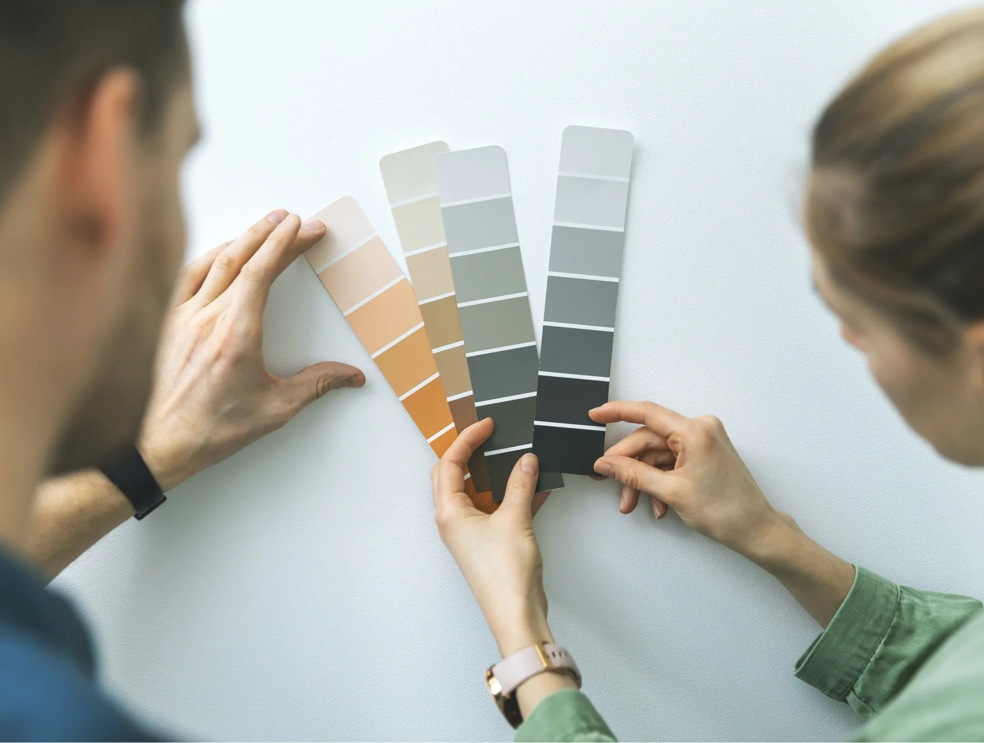
The best way to avoid colour regret is to test paint colours in your actual space. We always recommend our sample pot program. Pick up a few small pots of your favourite MF Paints colours. Paint a large swatch (at least 2x2 feet) on a few different walls in the room you're painting. Don't just paint a small square on a white background, the surrounding white will influence your perception. Observe the colours at different times of day, morning, afternoon, and evening, and under both natural and artificial light. See how they interact with your furniture, flooring, and existing decor. This crucial step, often skipped, is the single best way to ensure you love your chosen colour.
Why store lighting is different from home lighting
Paint stores, including Falls Decor in Smiths Falls, use specific lighting designed to show colours as accurately as possible under a standardized, neutral light. This ensures consistency across samples and helps you compare colours side-by-side without external light interference. However, your home's lighting is unique. It's influenced by window direction, tree cover, interior furnishings, and the type of light bulbs you use. What looks perfect under our optimized store lights will inevitably shift once it's on your wall at home. That's not a flaw in the paint or our matching, it's just the nature of light and colour.
Related concerns
Beyond lighting, other factors can influence how a paint colour appears. The colours of adjacent rooms, existing trim, and even large pieces of furniture can reflect onto your newly painted walls, subtly altering the perceived hue. The sheen of the paint also matters; a higher sheen will reflect more light, making a colour appear brighter and sometimes lighter than a flatter finish. Understanding these nuances helps you make a more informed decision for your painting project in Smiths Falls.
Next step: How Falls Decor helps you get the colour right
Don't let the complexities of light and colour overwhelm your painting project. At Falls Decor, our staff provide consultative guidance at the paint counter, helping homeowners select products and finishes while also serving professional painters who need fast, reliable supply and technical expertise. They’ve seen countless scenarios and can guide you through the process, helping you understand how specific MF Paints colours might behave in your home's unique lighting conditions. We're here to explain your options and help you choose what works best for your budget and needs, ensuring you get the colour you love. Visit us in Smiths Falls, and let's talk colour.
The questions we get asked most.
Online visualizers are a great starting point for inspiration, but they are not perfectly accurate. Screen calibration, room angles, and simulated lighting can distort colours. Always follow up with physical sample pots from Falls Decor to test colours in your actual home environment.
Yes, absolutely. A matte or flat finish absorbs more light, making colours appear deeper and richer, often with less variation. A satin or semi-gloss finish reflects more light, which can make colours appear brighter and show more variation depending on the angle of light. Consider the sheen along with the colour for your project in Smiths Falls.
Metamerism is when two colours appear to match under one light source but not another. It's a common phenomenon in paint, textiles, and other materials. This is precisely why your chosen paint colour might look perfect in our store but appear different once you get it home and see it under your specific lighting conditions. Our spectrophotometer colour matching helps minimize this, but testing samples at home is still crucial.
While painting directly on the wall is common, painting large sample boards (e.g., poster board or pieces of drywall) is often better. This allows you to move the sample around the room, observe it on different walls, and even prop it up against existing furniture and flooring. This gives you a more versatile view of the colour in various lighting scenarios in your Smiths Falls home.
While our sample pot program is the best way to test, if you're narrowing down initial choices, you can use large colour swatches available at Falls Decor. Tape them to your walls and observe them over a few days. While not as accurate as painted samples, they can help you eliminate colours that clearly don't work before committing to a sample pot. Remember, the larger the swatch, the better your perception.