
Lighting Changes Everything: How Light Affects Paint Colour Appearance
Lighting significantly impacts how paint colours appear, often making the same shade look entirely different depending on whether it's natural daylight, warm incandescent, or cool LED light. This is why a colour you love in the store might disappoint you at home. Factors like light intensity, direction, and colour temperature all interact with the pigments in the paint to alter its perceived hue, saturation, and brightness.
Why this matters for your colour choice
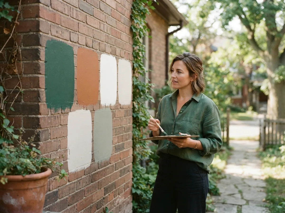
The fear of choosing a colour you’ll hate after it’s dry is real, especially when lighting plays such a trick. Understanding how light interacts with paint is crucial to avoiding disappointment. What looks like a serene grey under the bright lights of a paint store might take on a blue or even purple cast in your north-facing living room. This isn't about the paint being 'wrong,' but about the dynamic interplay between light and pigment. Taking light into account helps you make an informed decision and ensures the final result matches your vision for your Smiths Falls home.
Natural light vs. artificial light
Natural light, from the sun, is ever-changing throughout the day and year, bringing different colour temperatures. Morning light is often cooler and bluer, midday light is brighter and more neutral, and evening light tends to be warmer and redder. This means a paint colour will shift subtly with the sun's journey. Artificial light sources, however, have a more consistent colour temperature, but they vary widely between types. Incandescent bulbs emit a warm, yellow light, which can make cool colours appear duller and warm colours richer. Fluorescent lights often have a cooler, blue-green cast, while LED lights come in a spectrum from very warm to very cool, capable of mimicking natural light or introducing their own unique colour biases. It's essential to consider all light sources in a room when selecting your paint colour.
- 1
North-Facing Rooms
Receive cooler, indirect light. Colours will appear darker and more muted. Warm colours can help balance the coolness, while cool colours might feel even more stark.
- 2
South-Facing Rooms
Bathed in bright, warm light for most of the day. Colours appear truer and brighter. Cooler tones can help temper the intensity of the light, preventing a room from feeling too hot.
- 3
East-Facing Rooms
Get bright, warm morning light, which fades to cooler tones by afternoon. Colours will look different throughout the day. Consider how you use the room at different times.
- 4
West-Facing Rooms
Experience warm, intense afternoon and evening light. Colours will appear warmer and more saturated later in the day. Cooler colours can be refreshing here.
How room orientation affects colour appearance
The direction your room faces dictates the quality and quantity of natural light it receives, profoundly influencing how paint colours are perceived. A north-facing room, for instance, gets a consistent, cooler, and often dimmer light, making colours appear more subdued or even grey. Conversely, a south-facing room is flooded with bright, warm light throughout the day, which can intensify colours and make them appear brighter than expected. East-facing rooms enjoy bright, warm morning light that turns cooler in the afternoon, while west-facing rooms get intense, warm light in the afternoon and evening. Understanding these orientations is key to predicting how a colour will behave in your unique space in Smiths Falls.
Testing colours in your own lighting
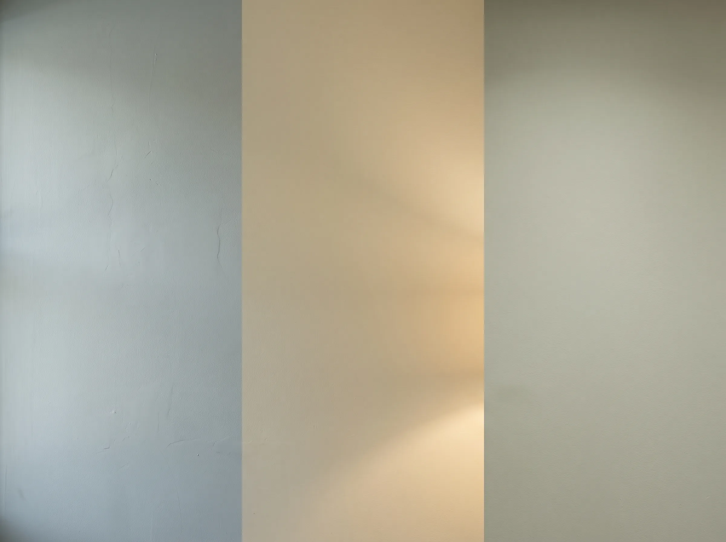
The single most effective way to avoid disappointment is to test paint colours directly in your home, under your specific lighting conditions. We recommend painting large swatches (at least 2x2 feet) on several walls in the room you intend to paint. Observe these swatches at different times of day, morning, noon, and evening, and under both natural and artificial light. This allows you to see how the colour reacts to the full spectrum of light sources and changes throughout the day. Don't rush this step; living with the swatches for a few days can save you from a costly mistake. Our staff can help you select appropriate sample sizes and offer advice on how to best test your choices.
Common lighting mistakes homeowners make
Many homeowners overlook the critical role of lighting in paint selection, leading to common mistakes. One frequent error is choosing a colour based solely on a small paint chip in a brightly lit store, without considering how it will translate to their home's unique lighting environment. Another mistake is failing to test paint samples on the actual walls; a colour can look very different on a small sample card held against a white background versus a large swatch on a textured wall. Relying on a single type of artificial light (e.g., only warm incandescent) when the room will have varied lighting throughout the day is also a pitfall. These oversights can result in a colour that feels off, too bright, too dull, or simply not what was envisioned, causing frustration and the need for a costly repaint.
How Falls Decor helps you account for lighting
Choosing paint can feel overwhelming, and the staff at Falls Decor understand that. We're here to help you navigate the nuances of colour and light with patience and expertise, ensuring you don't feel judged for not knowing every technical detail. We validate your anxiety directly: 'What if the colour match doesn't look right in my lighting?' It's a valid concern, and we guarantee colour matching accuracy. If a match isn't right, we’ll remix it for free. Our staff, some with years behind the counter, provide consultative guidance, helping homeowners select products and finishes while also serving professional painters who need fast, reliable supply and technical expertise. We use professional spectrophotometer equipment with staff who understand colour science for accurate in-store colour matching, ensuring the colour we mix is precisely what you chose. We’ll help you choose with confidence, backed by our guidance.
The questions we get asked most.
Natural, diffused daylight, typically from a south-facing window at midday, is often considered the most neutral light source, allowing colours to appear closest to their true hue. However, every room has unique lighting, so testing samples in your specific space is always best.
Yes, paint sheen plays a significant role. Higher sheens (like semi-gloss or high-gloss) reflect more light, making colours appear brighter and more intense. Flatter sheens (like matte or eggshell) absorb more light, giving colours a softer, richer, and often deeper appearance. This is another reason to test samples with the desired sheen.
Absolutely. Your existing furniture, flooring, and even decorative elements like curtains or artwork will reflect light and influence how your paint colour looks. These elements contribute to the overall colour scheme and should be considered part of the 'lighting' environment in your room. Bring photos or small samples to Falls Decor for consultation.
For rooms with minimal natural light, artificial lighting becomes even more critical. You might consider using brighter, higher-lumen bulbs or adding more light fixtures. Lighter paint colours can help reflect available light, making the room feel more open. Alternatively, embracing deeper, richer colours can create a cozy, intimate atmosphere. Our staff can advise on paint choices that perform well in lower light conditions.
It's a common concern. Falls Decor offers expert guidance to help clients choose with confidence. We recommend taking large paint samples home and observing them at different times of day and under various lighting conditions. Our team is patient, non-judgmental, and happy to help clients of all experience levels find the right colour, backed by a satisfaction guarantee on staff recommendations.