
Neutral vs Bold How to Decide Your Colour Direction
Deciding between neutral and bold paint colours depends on your desired mood, the room's purpose, and existing decor. Neutrals offer versatility and a calming backdrop, ideal for longevity and broad appeal. Bold colours create drama and personality, best for making a statement or defining specific zones. Consider starting with neutrals, then introducing bold accents to test the waters without full commitment.
When neutrals are the right choice
Neutrals are the workhorses of interior design. They provide a timeless, versatile backdrop that allows furniture, art, and natural light to shine. Choosing neutral paint colours like soft greys, warm beiges, or classic whites is often the right choice when you prioritize a sense of calm, want flexibility for future decor changes, or are painting spaces that serve multiple functions. These colours are excellent for open-concept living rooms, bedrooms where relaxation is key, or when preparing a home for sale. They offer a subtle elegance that never goes out of style and can make a room feel larger and brighter.
Timeless Appeal
Neutrals offer longevity, resisting trends and providing a foundation that remains fresh for years.
Design Flexibility
Easily update your decor with different accessories without needing to repaint your walls.
Enhanced Space
Lighter neutral tones can make smaller rooms feel more open and expansive.
When bold colours work best
Bold colours are for making a statement. They inject personality, energy, and a distinct mood into a space. If you're looking to create a focal point, define a specific area, or express a vibrant personal style, bold paint colours like deep blues, rich greens, or vibrant reds can be incredibly effective. These colours work wonderfully in dining rooms to stimulate conversation, in home offices for a jolt of creativity, or as accent walls in bedrooms. They can transform an ordinary room into an extraordinary one, reflecting your unique taste. However, the fear of choosing a colour and hating it after it's dry is real. At Falls Decor, we offer expert guidance to help you choose with confidence, backed by our commitment to helping you get it right.
The "safe first" approach
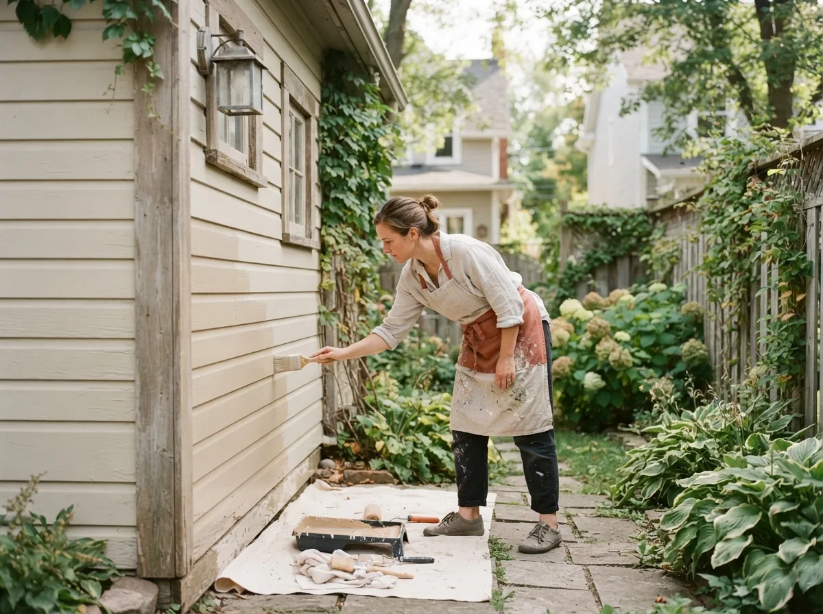
Many homeowners in Smiths Falls find comfort in a 'safe first' approach when tackling a new paint project. This often means starting with a neutral base colour for the majority of the home and then layering in bolder colours through accessories, furniture, or even a single accent wall. This strategy minimizes the risk of regret while still allowing for personal expression. It’s also a great way to gauge how different colours interact with your home's natural lighting throughout the day, ensuring the final look is exactly what you envisioned.
How to test bold colours without commitment
Committing to a bold colour can be daunting. The good news is there are several ways to test a bold shade without painting an entire room. Start with large paint swatches or sample pots from MF Paints. Paint a section of your wall, or even a large piece of poster board, and observe it in different lighting conditions and at various times of day. Pay attention to how it interacts with your existing furniture and flooring. This helps you understand the true impact of the colour in your specific space before making a full commitment. Remember, if the colour match isn't right, Falls Decor guarantees colour matching accuracy and will remix it for free.
- 1
Get Sample Pots
Pick up small sample pots of your chosen bold colours from Falls Decor to test them directly on your walls.
- 2
Observe in Different Lights
Watch how the colour changes with natural daylight, artificial light, and at various times of day.
- 3
Consider Your Decor
See how the bold sample harmonizes with your existing furniture, artwork, and textiles.
A simple decision framework for your space
To simplify your decision between neutral and bold, consider a few key questions: What mood do you want to create in the room (calm, energetic, sophisticated)? What is the primary function of the space? What existing elements (furniture, flooring, artwork) need to be complemented? For instance, a high-traffic hallway might benefit from a durable neutral, while a powder room could be a perfect canvas for a dramatic bold shade. Our staff, some with over 20 years behind the counter, provide consultative guidance at the paint counter, helping homeowners select products and finishes. They are patient, non-judgmental, and happy to help clients of all experience levels in Smiths Falls and surrounding Lanark County, ensuring you get it right.
The questions we get asked most.
Absolutely. Mixing neutrals with bold accents is a popular and effective design strategy. Use neutrals for larger surfaces like walls, then introduce bold colours through cushions, rugs, artwork, or even a single piece of statement furniture. This creates visual interest without overwhelming the space.
In a small room, use bold colours strategically. Consider an accent wall, or use a bold colour on trim or built-in shelving rather than all four walls. Pairing a bold colour with plenty of white or light neutral elements, and ensuring good lighting, can prevent the room from feeling closed in. Our staff can help you balance these elements effectively.
If your furniture is already a strong colour, using neutral walls can provide a calming balance, allowing your furniture to be the focal point. However, you could also choose a complementary bold wall colour to create a more immersive, dramatic effect. It depends on your desired intensity and the overall style you're aiming for. Bring a photo of your furniture to Falls Decor for personalized advice.