
Why Paint Looks Different on Your Wall vs the Chip?
Paint often looks different on your wall compared to a small chip due to how light interacts with a larger surface, the room's unique lighting conditions, the texture of the wall, and the influence of surrounding colours and objects in the room. A small chip can never fully replicate these real-world conditions.
It's a common frustration: you pick out what seems like the perfect paint colour from a chip, only to apply it and find it looks completely different on your wall. This isn't just your imagination or a bad batch of paint. There are several scientific and environmental factors at play that cause paint colours to appear differently once they're applied to a larger surface in a real-world setting. Understanding these factors can help you avoid future disappointment and choose colours with confidence.
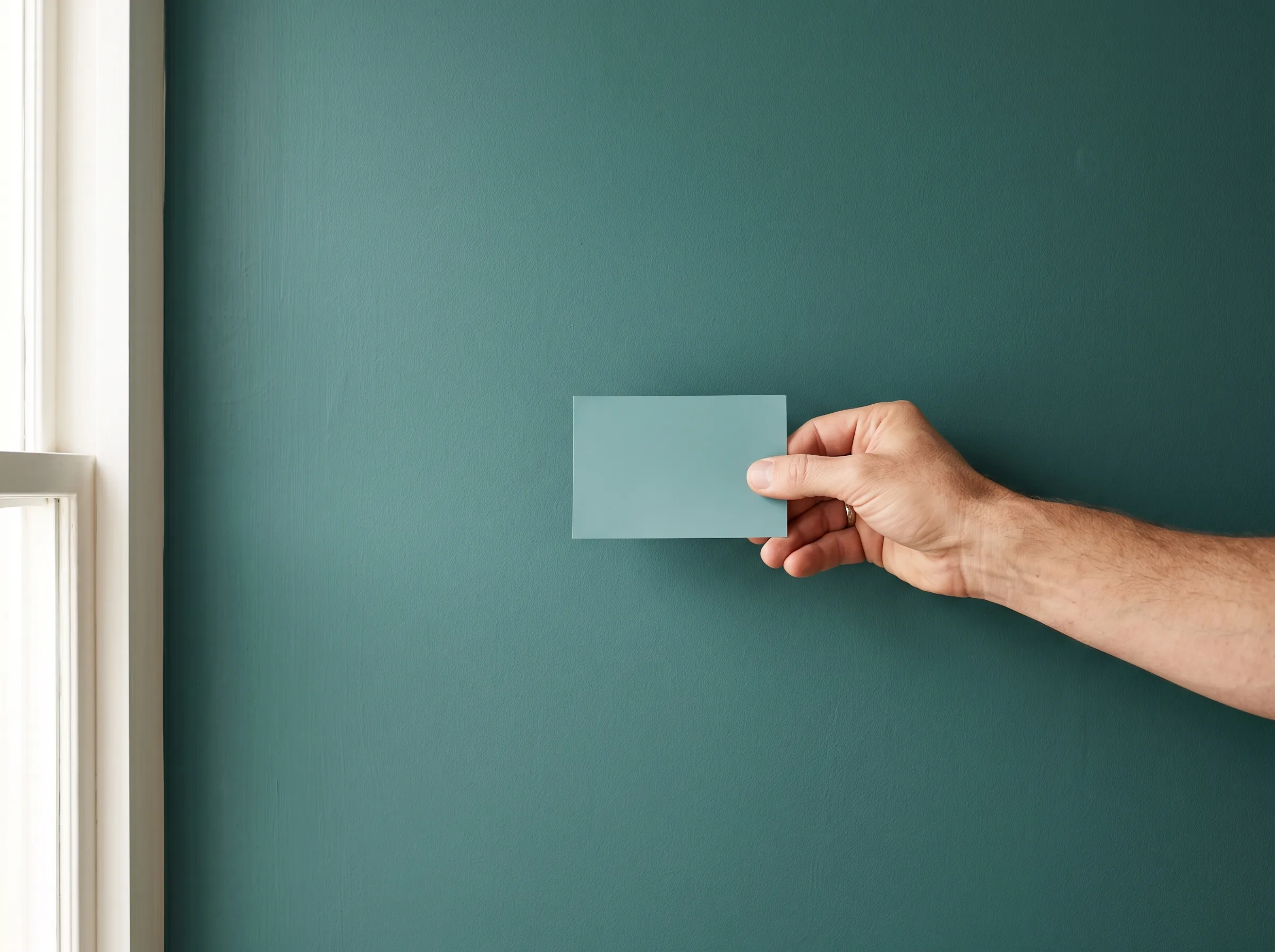
How lighting affects colour appearance
The type, intensity, and direction of light in a room dramatically change how paint colour is perceived. Natural light from windows shifts throughout the day, from warm morning light to cooler afternoon light. Artificial light sources, like incandescent, LED, or fluorescent bulbs, each have their own colour temperature and can make the same paint appear warmer, cooler, brighter, or duller. A colour that looks vibrant under bright white light might seem muted in a dimly lit space with warm-toned lamps.
How surface texture affects colour appearance
The finish of your paint, whether it's matte, eggshell, satin, or gloss, plays a significant role in how light is reflected and, consequently, how the colour is seen. A matte finish absorbs more light, making colours appear deeper and richer, but also potentially darker. Higher sheen finishes, like satin or gloss, reflect more light, which can make a colour seem brighter and lighter, but also reveal more imperfections on the wall's surface. Even the underlying texture of your drywall or plaster can subtly alter how the paint colour registers to the eye.

How surrounding colours affect colour appearance
Your brain interprets colours not in isolation, but in relation to everything else around them. The colours of your furniture, flooring, artwork, and even the view outside your window can influence how a paint colour appears on your wall. A paint that looks perfectly neutral on a small chip might pick up a subtle green hue from a large tree outside, or seem warmer next to a red brick fireplace. This phenomenon, known as colour constancy, means your eyes are constantly adjusting based on context.
Why the chip is not a reliable preview
Paint chips are designed to give you a reference point, but they can't replicate the full experience of a painted wall. They are small, often viewed under different lighting conditions than your home, and don't account for the large surface area effect. When you see a colour on a tiny chip, your eye perceives it differently than when that same colour covers an entire wall, surrounded by your home's unique environment. This is why relying solely on chips often leads to unexpected results and colour selection anxiety.
- 1
Get samples and test them
The best way to avoid surprises is to purchase small sample pots of your chosen colours. Paint large swatches directly onto your wall, or onto poster board that you can move around the room. Observe them at different times of day and under various lighting conditions.
- 2
Consider your lighting
Think about the dominant light sources in your room. Is it north-facing (cooler light), south-facing (warmer light), or does it rely heavily on artificial light? Test your samples under these specific conditions.
- 3
Look at surrounding elements
Pay attention to how the paint samples interact with your existing furniture, flooring, and trim colours. Consider whether the new colour complements or clashes with these elements.
- 4
Seek expert advice
Don't hesitate to ask for help. Our staff at Falls Decor are patient, non-judgmental, and happy to help clients of all experience levels navigate these choices. Some of our staff, with years behind the counter, can offer valuable insights into how colours behave in different settings.
Next step: How our colour matching service helps you get it right
Even with careful testing, sometimes you need a specific colour matched perfectly, whether it's to an existing fabric, a piece of art, or a colour you've seen elsewhere. At Falls Decor in Smiths Falls, we understand that getting the colour right is crucial. That's why we use professional spectrophotometer equipment and our staff understand colour science for accurate in-store colour matching. We guarantee colour matching accuracy, and if the match isn't right, we will remix it for free. Our team provides consultative guidance to help homeowners select products and finishes, ensuring you choose with confidence and love the result.